Data-ish
a newsletter for people who want to make more sense of their data.
TLDR:
It’s impact report season and the visuals you choose influence how readers interpret your results.
Things that make you go hmmmm.
What to think about when choosing how to show your story.
We reached a lot of people.
This story is about volume. It answers 'how many'?
Consider: Bold, big number
Why it works: Big numbers are easy to process. They quickly signal scale and focus attention exactly where you want it.
When not to use it: If the audience needs to see proportionality or results across groups.
Our reach in context.
This story is about your reach in relation to external data. It answers: Are the people we serve similar to the people in our community?
Consider:
Side-by-side percentages (e.g. 33% of anytown USA are ages 35-64 45% of clients served in 2024 are ages 36-64)
Why it works:
It shows alignment and reach.
A high percentage indicates you are meeting a local need.
A lower percentage highlights an outreach opportunity.
When not to use it:
If your audience cares more about the total number served than proportionality.
For every X people in town, we serve Y of them.
This story is about the depth of reach.
It answers: How much of the community are we serving?
Consider: Pictogram
Why it works: People understand ratios.
When not to use it:
If your rate is below 3–5%, the visual loses power. (e.g. 1 in 40 is hard to visualize, a standalone percentage may be better.)
Field Notes
Common Visualization Mistakes That Make Good Data Look Bad
Good data often gets misunderstood, skipped, or ignored, not because it is wrong but because the visual works against the message. Here are a few of the biggest culprits.
The “Look How Many Numbers We Have” Dashboard Screenshot
Dashboards are meant for internal exploration, not external storytelling. Dropping a screenshot into an impact report puts the burden on the reader to find meaning.
Tip: Choose one or two visuals from the dashboard that directly support your message and give them context.
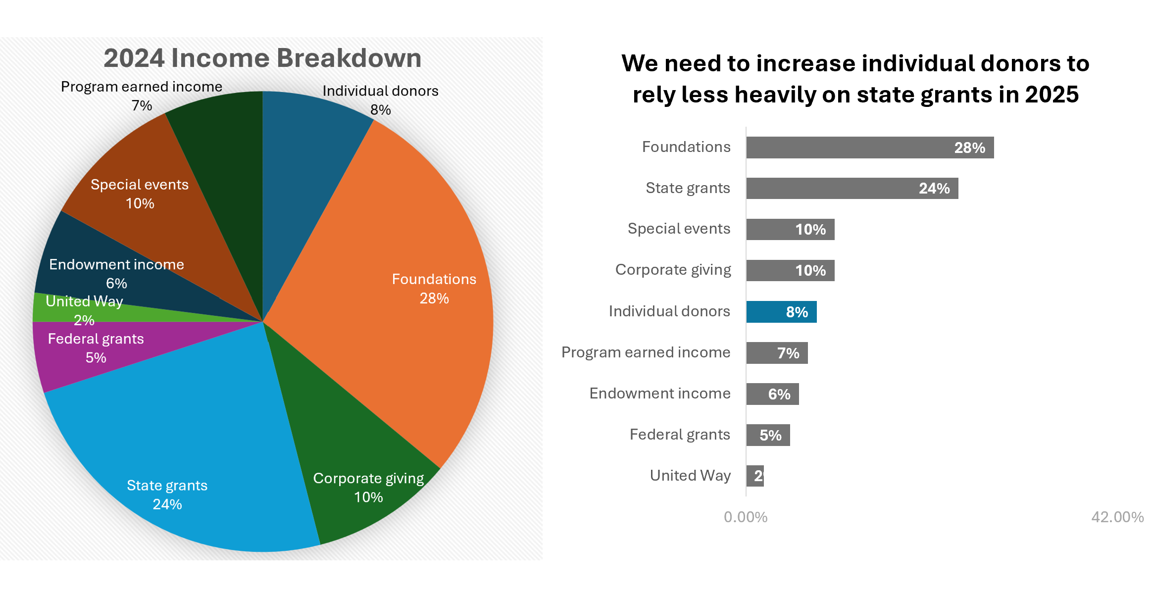
The 5+ Slice Pie Chart of Doom
If you want people to understand that you need more individual donors, a tiny slice of a 20-piece pie will not do the job. It tells people your funding is complicated, not that you need support.
Tip: Try a simple horizontal bar chart that highlights the gap you want to close.
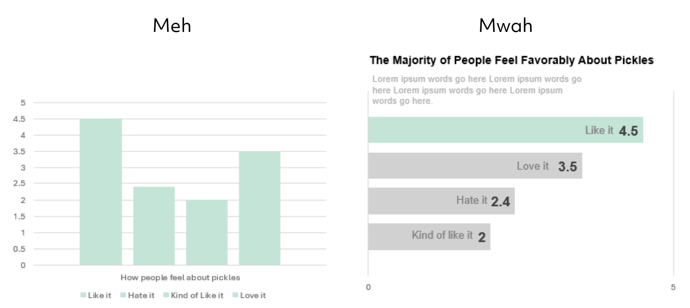
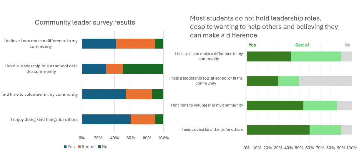
The Default Chart Format That Makes Your Reader Do Visual Gymnastics
Just because Microsoft hands you a default chart doesn’t mean you have to keep it. The layout, colors, and legend placement make people decode the chart instead of understanding the message. They have to hunt for labels, match colors to categories, and guess at what the visual is trying to highlight.
Tip: Simple, non–data-wonk moves can turn a default chart into a visual that actually communicates.
Napkin Doodle Prompt
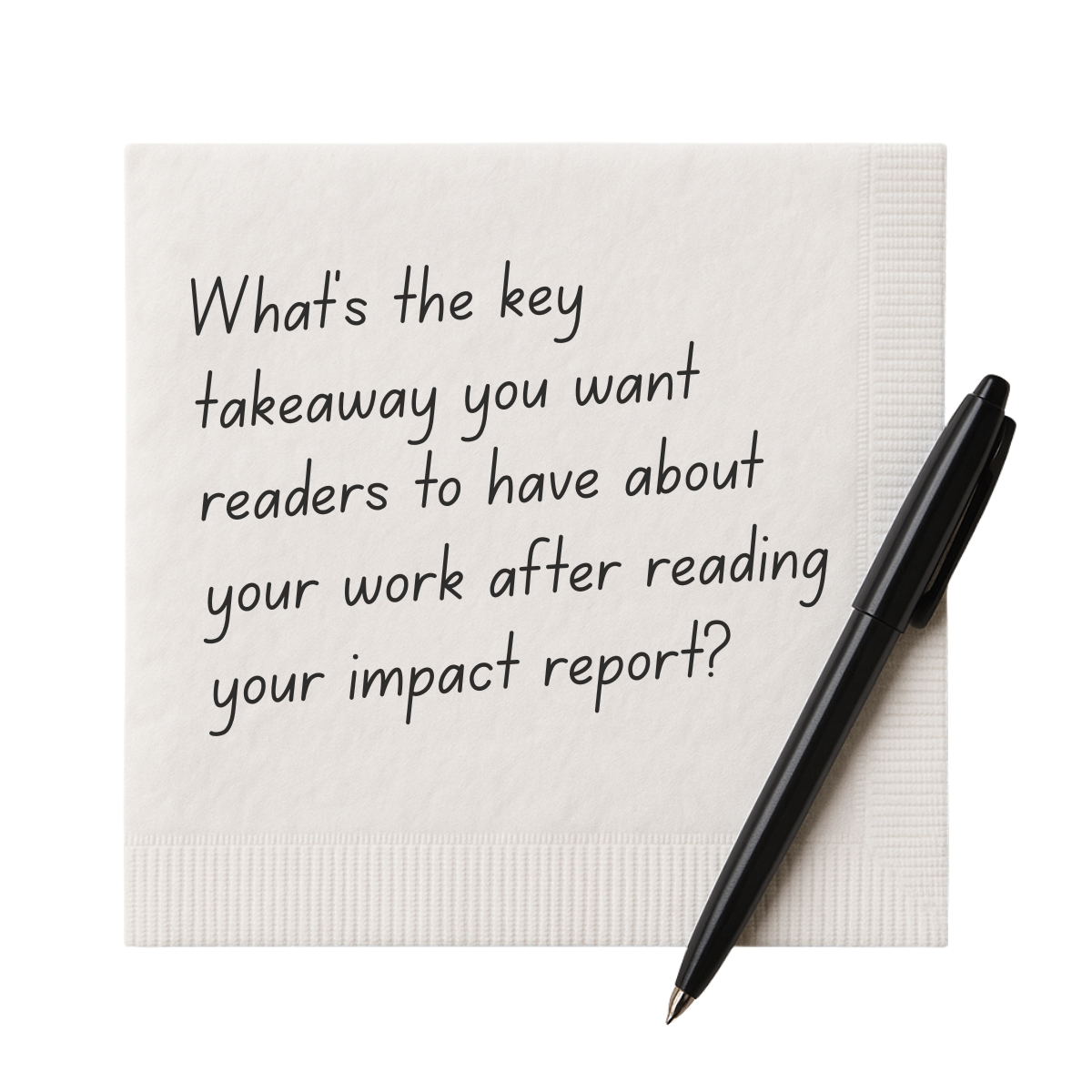
Once you know the story you want to tell, the visuals can follow.
Need a hand telling your story?
Rad Resources
Data that Delivers Workbook
A good visual communicates. It does not decorate.
Different audiences may need different stories. Sharing only what matters builds trust.
This tool helps you shape your message, select the right data, and present it in a way people understand.