Data-ish • Data Viz + AI
Short on time? Here's the gist.
AI will generate data visualizations faster. Whether faster means better depends on whether you know the story you want to tell before you open the tool.
Things that make you go hmmmm.

Beware the promise of ease.
AI visualization tools produce outputs that look polished and professional from the first try. A confident-looking chart can hide errors in your underlying data or make design choices your audience cannot read. AI is a thought partner, not a decision-maker. The outputs are a starting point, not a finished product. You are the one who decides whether the chart tells the right story to the right people.
Field Notes
The tool decides when you do not.
AI makes interesting choices when you give it data without context. A scatter plot with a trend line may be the statistically appropriate method for the question you asked. It may also make your board’s eyeballs bleed. Only you know the right …
Play tools off each other.
Every AI tool makes different choices. An effective way to pressure-test an output is to run the same prompt through multiple systems and compare the results. Where all three agree, you have a more defensible result. Where they diverge, you have a question worth investigating before you publish anything.
The example below used a mock dataset from a fictional human services organization consisting of client demographic data, start date of their engagement, services they use, and the most recent engagement with the organization. It purposefully included dirty data. We fed the data to Claude (paid), Gemini, and ChatGPT (free) with a prompt to pick the visualization method to tell the story of which clients by age were most likely to engage for the longest period. All three chose a scatter plot with a trend line.

Gemini

Chat GPT

Claude
For a research question, a scatter plot is a solid choice. It can show whether a relationship exists between two things, like age and how long someone stays engaged in a program. Every dot is a data point, and the trend line tells you whether the pattern holds when you look at the full dataset.
For communicating to a non-data audience whose attention you are competing for, a scatter plot asks too much. It requires readers to determine the takeaway themselves,
Readers often try to read the cluster as a single shape rather than as individual data points.
The trend line shows a statistical relationship, not a cause. Most readers interpret it as a cause.
Two axes requiring simultaneous interpretation are a lot for readers who are not accustomed to reading this chart type.
Start with the communication framework
Before you create any visualization, AI or otherwise, be clear about what you are doing and why. Without that clarity, you have no criteria to evaluate what the tool gives you. Consider using this madlib to help:
I want to tell [audience] about [topic] by sharing [data] so that they will know [insight] and they will [action].
You know your audience's familiarity with the data and what level of complexity serves them. You know what counts as noise because you know the main point you are trying to get across.
Data-ish Community
I built the Data-ish newsletter for everyone who has ever found themselves in that seat. As budgets shrink and demands for data grow, a newsletter stopped feeling like enough.
The Data-ish community is for people who want to go further. Each month, members get an expanded issue, a structured activity to try with their own data, and a live Zoom to talk through what they found with each other and with me.
The community section below shows how the outputs changed with better prompts. Non-members have access to community content and our live monthly gatherings through Q3
Data-ish members only content
•
Data-ish members only content •
Prompt for what you need.
Use the communication framework madlib and data visualization best practices to return results closer to what you need.
Revised prompt
“Communication madlib
I want to tell my board of directors about which age group is most likely to engage in services for the longest period of time, regardless of the service, so that we can invest in infrastructure supporting that subset of clients, and board members will be able to communicate that single data point when describing our services externally.
Data viz best practices
Consider the following data visualization standards in your revised visualization: pull an accurate insight that is a complete sentence. Make that insight the chart’s title, in sentence case, with a period. Use an appropriate chart choice for the data. Order data intentionally. Use 2-D only. Start bar chart axes at zero. Use color to highlight patterns, not to decorate. Remove or mute gridlines. Build legends into the visual. Highlight a single, significant finding.”
Outputs
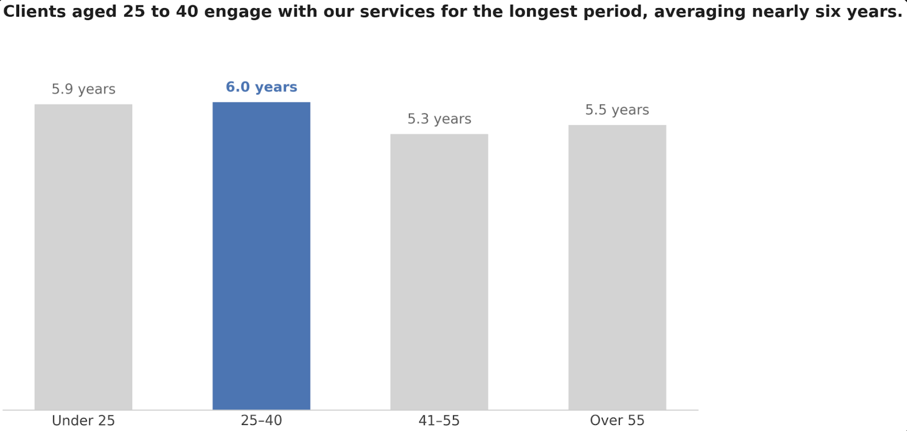
Source Gemini
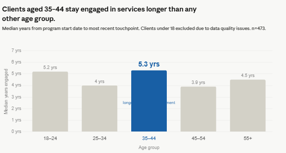
Claude
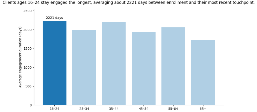
Chat GPT
A note on end-user readiness.
Both Claude and Gemini
Put data labels with the bars so the reader doesn’t have to look left at the access to see what the bars mean.
Converted the day data point into years to make the results more accessible
Pretty doesn’t equal perfect.
We successfully got closer to a usable visualization - but what if that visualization was designed off of dirty data? After the revised charts came back, we asked the models to reflect on the outputs:
Try this: Does this visualization include dirty data that skews the results pictured?
Gemini flagged that the age logic in the synthetic dataset was inverted: 16-year-olds enrolled in Senior Services, clients in their 60s enrolled in Youth Programming. The finding that the tool had confidently illustrated was a statistical artifact of a broken dataset.
Claude went further. It identified 49 impossible records where a client’s engagement duration exceeded how long they could have been enrolled, given their current age. The youngest cohort’s engagement median dropped from 5.2 years to 2.1 years once those records were removed. The finding held, but the group it pointed to changed.
ChatGPT flagged engagement durations of 17 to 19 years and noted they should be reviewed, then recommended rebuilding the visualization with median rather than mean engagement duration to reduce the effect of outliers.
The tools gave useful critiques, but only because a human knew to ask for them.
Members Only Activity
This month’s activity builds on the work from the June issue. If you completed that activity, pull one of your cleaned datasets. If you are starting fresh, use any dataset from your current work and anonymize it before you begin.
Step one: Write your communication sentence before you open any tool. Audience, topic, data, insight, action. Write it down.
Step two: Run the same prompt through two different AI tools. Ask each one to suggest the best visualization method for the story you identified in step one. Save both outputs.
Step three: Add this prompt to each tool: “Does this visualization include any data quality issues that could skew the results? What would you recommend checking before publishing this finding?” Save the responses.
Compare what the tools flagged against what you know about your own data. Did either tool catch something you would have missed? Did either tool miss something you caught?
Bring your outputs and your data quality notes to the July Zoom.